
10.31.2008
10.29.2008
10.28.2008
42 Views of Tokyo

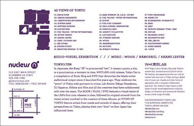 For me, it doesnt scream perfect, or make my skin tingly, but I do enjoy the vector elements on the front
Tags:
art show,
exhibition,
Japan,
tokyo
10.27.2008
10.26.2008
Andrio Abero
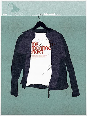


If I had a goal for my portfolio, it would be to have it as comprehensive, prestigious, polished, signature as Andrio Abero's (33rpm). You might have seen the top one for My Morning Jacket, and like me have wondered who was responsible for the cleanliness, wonderful palette and textured style.
10.25.2008
10.24.2008
10.22.2008
10.20.2008
Eve Dumahel

I've been trying to stick to the smaller medium, straying as much as I can from posters, but this one for Raking Leaves in the Wind really is impressive. I don't see how work like this can be ignored. It's something that just pulls you in, just upon a glance. So much depth, textures; its practically tangible. See Eve Dumahel's portfolio for more.
Bird Carnival
 Forgot where I found this from, but it's just so eye-catching but simple. Love the subtle textures, the color, and great use of space and space-filling.
10.19.2008
Gash

I really love how someone was able to fit in all that information rather creatively, its just an example of great planning (or superior layout intuition) that blends in with the image but also yells at you simultaneously.
This Is not London - Poster

One of a pretty large series of events, You might remember something familiar from my other This Is Not London flyer a while back, which had a really ugly typesetting job on the back; too horrid even to show. This is the poster that I was talking about that did a much better job; it even looks like a real neon glow effect; simple but very well executed, especially with the colors. Thanks to George for forwarding that over, I couldn't find one on the streets that wasn't demolished by rain.
10.16.2008
10.15.2008
Warped Tour


Before I left LA, I've been seeing the Warped Tour posters and flyers for a while, so I figured I'd post it up along with last year's. Couldn't track down the design credits, so if you could let me know, that'd be great.
10.13.2008
10.11.2008
SXSW


Just a few pieces I was able to scrounge up for the SXSW festival. The first and last one seem to be the strongest.
10.10.2008
Hard Rave Life
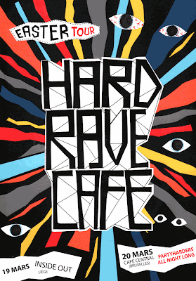
There are only a few styling elements in here, but they're well chosen. The font of the headline complements the random lines behind it, when juxtaposed on the colored background makes for a centerpiece that really seems to pop-off the paper. I might be biased, its a very similar palette as my portfolio page.
10.09.2008
Infatuation
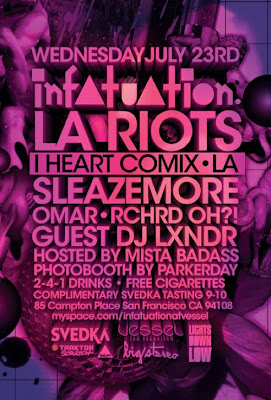


Another texture-heavy piece. Love the powerful color. The random items piled together for the background complete the composition nicely. Done for Vessel in San Francisco. First piece via Flying Flyer.
Tags:
3d,
club,
dj,
party,
san francisco,
typography
10.07.2008
INS
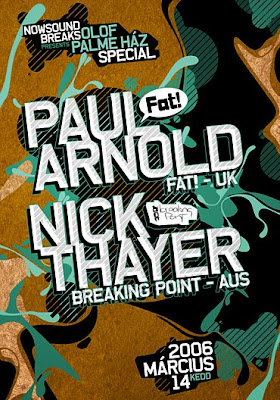

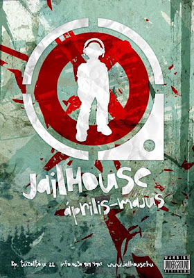

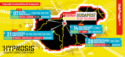

This guy has some sick designs. The typography and color schemes are spot-on, typography and layout unconventional, and the imagery ranging from well-planned simplicity to overwhelming details. What really sets his stuff apart is the little things he throws in, like the Split-open "FRIENDLY" on the last piece, the shadows and textures on the second (Jailhouse), and the textures on the first.
10.06.2008
10.05.2008
Simon Lord


This guy is another talented illustrator/gig flyer designer from the UK. Even without color, the doodles are so random that they instantly evoke a "WTF?" or a "this is awesome" response.
10.04.2008
Its About Time

 Love the unique presentation of the title...A pun of sorts but very well executed. Nothing wasted. Very simple, efficient and straightforward. It's minimal but it gets the job done of being attractive.
10.02.2008
Rich Medina


Rich Medina isn't the designer of this one, but you gotta love the typography that resembles scribbles but still pretty clear. Semi-retro, young, vibrant, and breathes energy from the color scheme to the layout. And I love the chunky text work for the artist's name on the front, it's simple but it still sticks out hard.
Subscribe to:
Posts (Atom)


